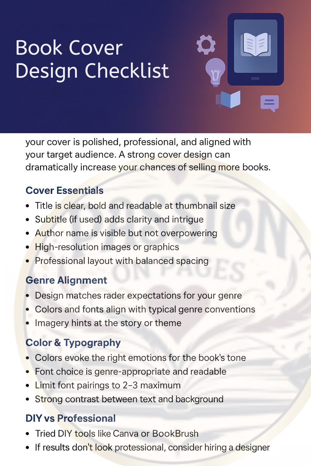
The Ultimate Guide to Book Cover Design That Sells
A practical, example-driven guide for indie authors and publishers. Download the free printable checklist at the end of the post.
On this page
Intro: Why your book cover is your #1 marketing tool
In a crowded marketplace, your cover is the fastest way to communicate who your book is for and why someone should click, open, or buy. Studies show most readers decide based on the thumbnail — so your cover must read clearly at small sizes, match genre expectations, and communicate quality.
Think of the cover as an ad: it must hook, inform, and convert. Investing in cover design isn’t optional — it’s essential marketing.
Anatomy of a high-converting book cover
- Title & Subtitle → must be legible at thumbnail size. Subtitle clarifies the promise.
- Author Name → placement depends on brand strength.
- Imagery & Graphics → hint at tone and content; avoid clichéd stock photos.
- Background & Texture → subtle textures add depth but avoid busy designs.
- Hierarchy & Layout → eye should travel title → image → author; keep balance and whitespace.
Design rules for different genres
Romance
- Warm or pastel colors
- Script/elegant serif titles
- Intimate or emotional imagery
Thriller & Mystery
- Dark, high-contrast palettes
- Bold sans-serif titles
- Minimal, suspenseful imagery
Fantasy & Speculative
- Illustration or epic photography
- Ornate typography, rich textures
Non-fiction (Self-help, Business, Memoir)
- Clean, modern layouts with hierarchy
- Photos for memoirs, icons/minimal art for business/self-help
Children’s & YA
- Vibrant colors, playful fonts, bold illustration imagery
Color psychology in cover design
- Red: passion, urgency — thrillers, romance
- Blue: trust, calm — business, self-help
- Yellow: optimism, creativity — upbeat non-fiction, children’s
- Black/Gray: sophistication or menace — literary, thrillers
Tip: Choose 2–3 colors (dominant + accent + neutral).
Fonts & typography that work
- Prioritize legibility — test title at 60–90px thumbnail.
- Limit families — usually 2 fonts max.
- Pair thoughtfully — bold sans-serif title + serif subtitle.
- Avoid heavy shadows, outlines, overly-condensed/script fonts for long titles.
Pro tip: Export a 200×300px thumbnail and test readability on mobile.
DIY cover design tools (Canva, BookBrush)
Canva
Pros: easy templates, fast iterations.
Cons: can look generic, reused assets.
BookBrush
Pros: author-focused templates, 3D mockups, marketing assets.
Cons: smaller asset library.
Workflow for DIY covers:
- Research 10–15 top-selling covers in your category.
- Build a moodboard (colors, fonts, imagery).
- Design the title first (check thumbnail readability).
- Add imagery, refine contrast.
- Export thumbnail, get feedback, iterate.
Always purchase correct stock photo licenses; avoid overused images.
When to hire a pro (and where to find them)
Hire a pro when:
- DIY cover looks cheaper than competitors.
- You need print-ready files (spine/back cover).
- You’re aiming for bookstore/library placement.
Where to find designers:
- Reedsy → vetted, higher cost/reliability
- Fiverr & Upwork → wide price range, check portfolios/reviews
- 99designs → contest model for multiple concepts
Typical budgets: $150–$500 (indie covers); $500+ (bespoke/illustration).
Mistakes to avoid in cover design
- Using low-res images (export at 300 DPI for print).
- Cluttered design — preserve whitespace.
- Poor thumbnail readability.
- Genre mismatch.
- Copying existing covers — take inspiration, not replicas.
Conclusion: Invest in your cover = invest in your success
Your cover is the first line of marketing — sometimes the only chance to make a sale. Test thumbnails, gather feedback, and when in doubt, hire a pro who knows your genre and market.
Resources:
Download: Book Cover Design Checklist (PDF) Hire a Pro on ReedsyDid this help? Share this guide, save the checklist, and join our newsletter for indie author tips.
Services: Formatting · Complete Ebook Solutions